When founded in 1993, Taiwan-based UKEAS created an entirely new industry based on advising students seeking to study overseas. Since then, UKEAS has helped tens of thousands of students study in English-speaking countries.
After opening offices in nine additional countries, including Nigeria, Thailand, and India, UKEAS decided to take another major step by transforming into Intake Education in September 2021. Through the rebrand, the company wanted to expand its services and brand presence to better serve the rapidly changing world of overseas education.
UKEAS sought the help of DDG to lead the company through this transformational process.
Identifying the path ahead
DDG discovered the UKEAS team was most passionate when talking about connecting students with the overseas education opportunity with the greatest potential to impact their future. This was defined as UKEAS’ core purpose.
Also, it became clear UKEAS’ main differentiation was the insightful and inspirational advice it provides to each individual student. This approachable, student-first model is becoming an increasingly important differentiator amid the rise of AI-driven platforms. Therefore, instead of following its competitors down the algorithm route, UKEAS decided to prioritize impactful, personalized advice that can change students’ lives. As such, “advice” became UKEAS’ Brand Catalyst®, the big idea driving thinking and action at the company.
The future in you
With ambitious goals for worldwide expansion, UKEAS sought a new brand name to cover the increasing breadth and depth of its responsibilities as a leading overseas education advisory service. “Intake Education” was chosen, as the name captures the vital role the company plays in supporting students and institutions on both sides of the academic intake process.
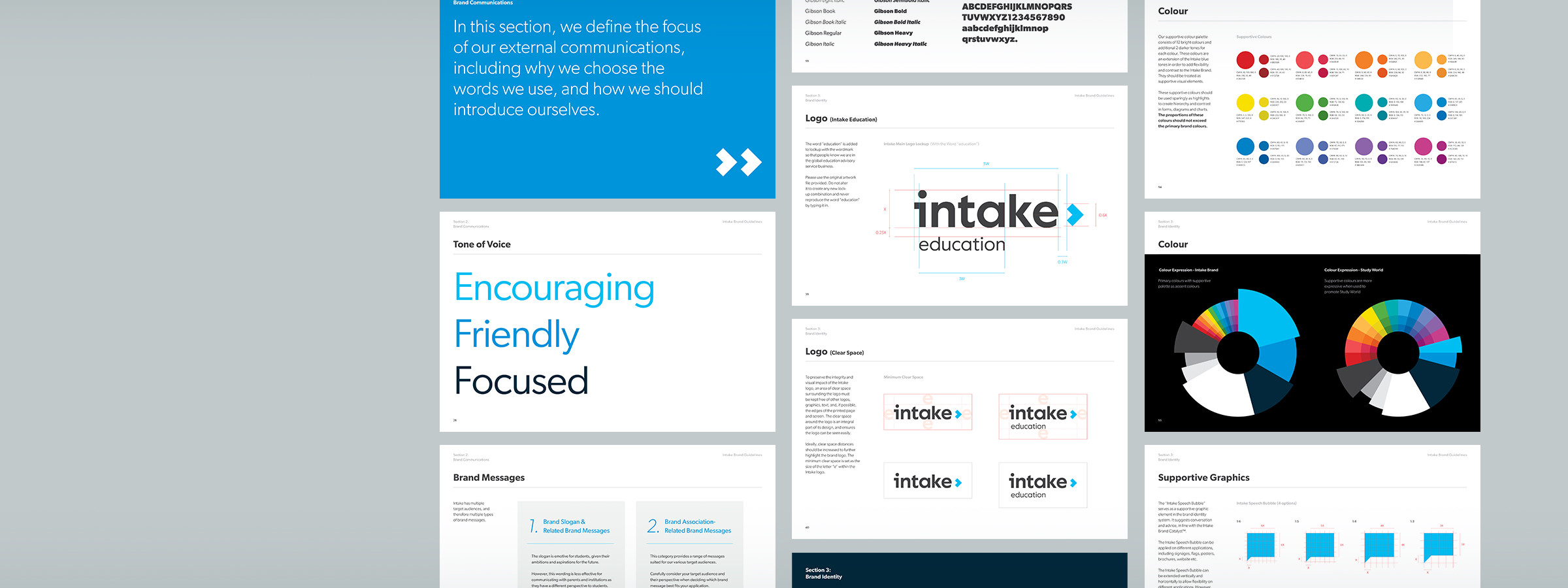
Next, DDG developed a communications strategy centered on a student-focused slogan — The Future In You — to highlight the higher purpose driving Intake’s advice. Additional brand messages and tone of voice rules were also defined to guide consistent, yet flexible and creative branding and marketing communication efforts in all regions, for years to come.
A trusted, approachable advisor
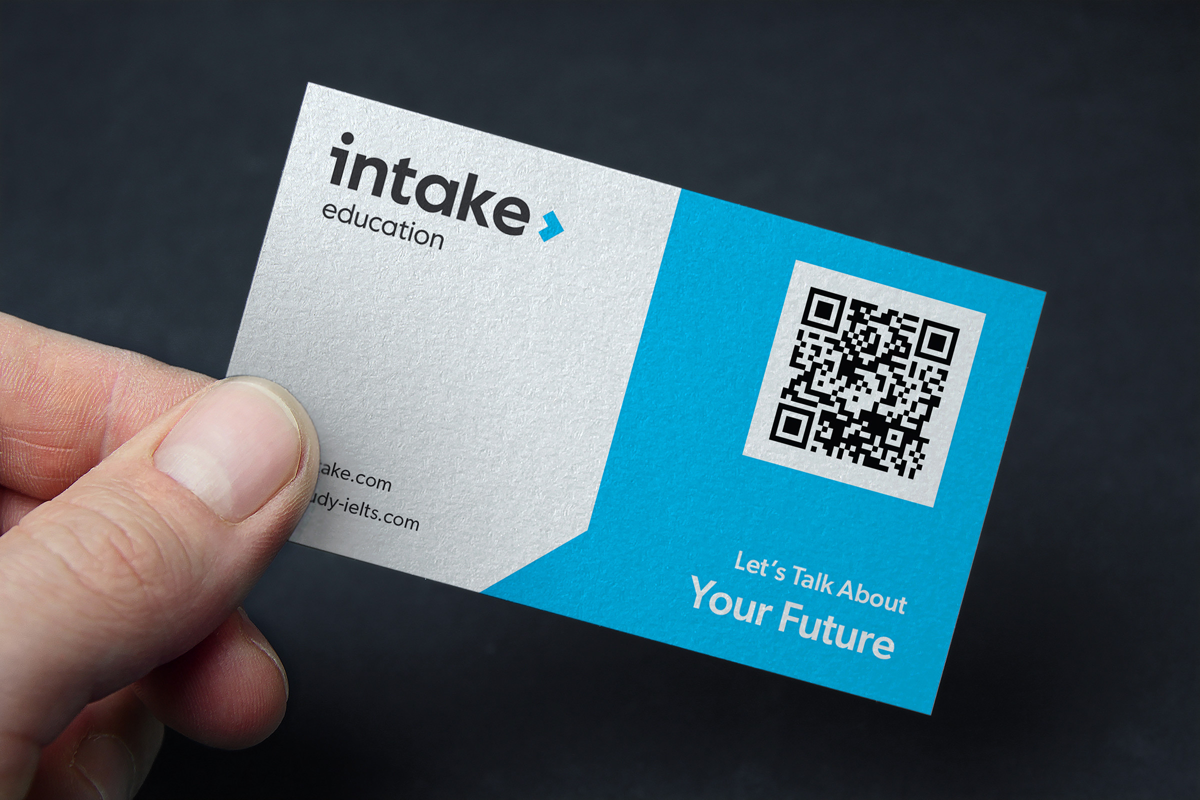
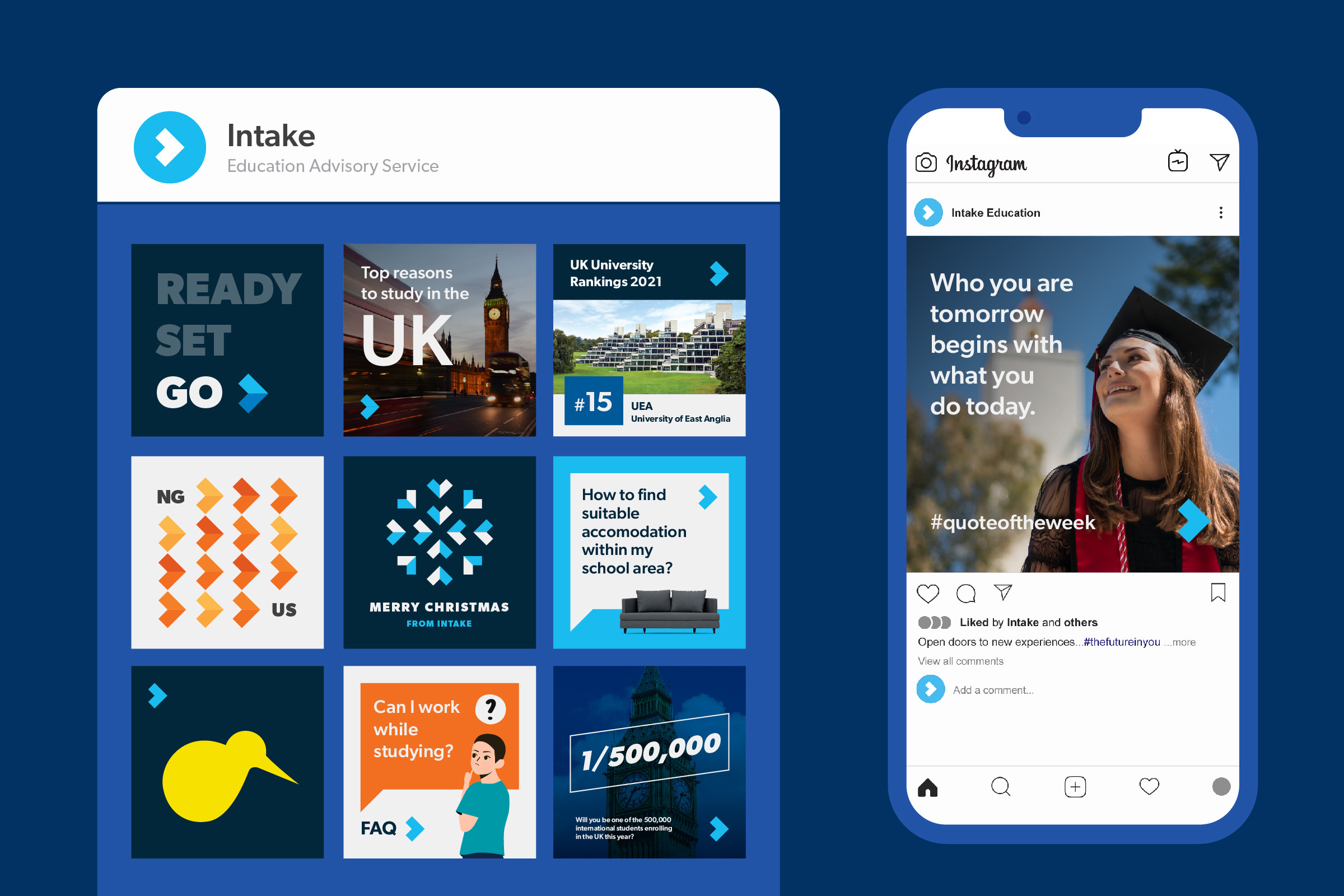
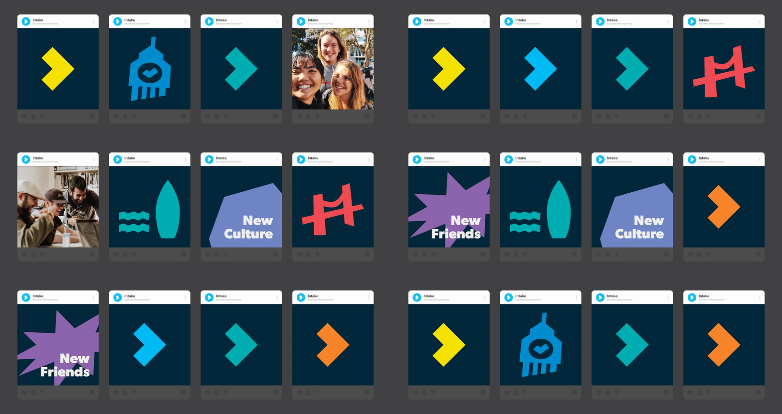
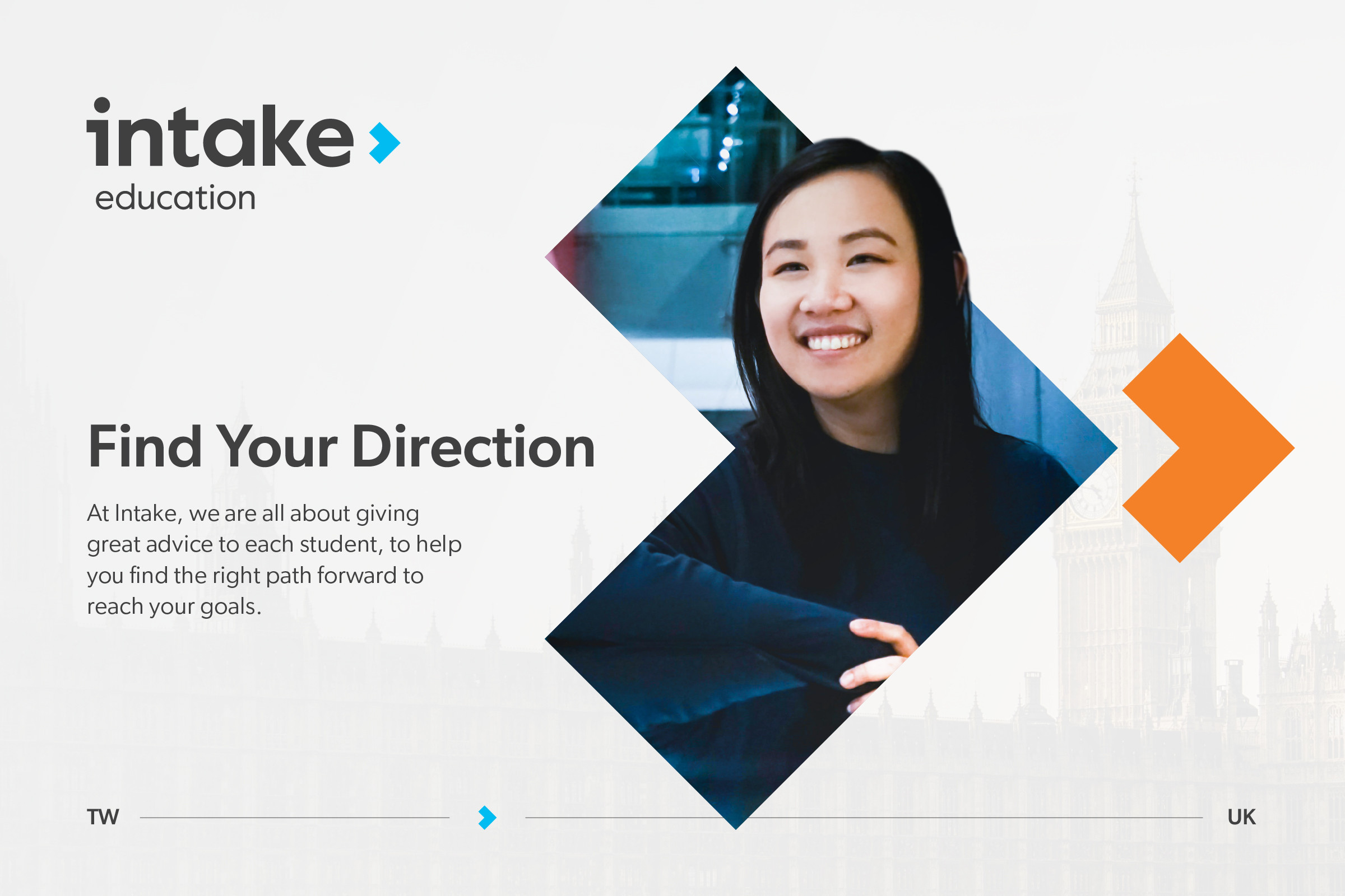
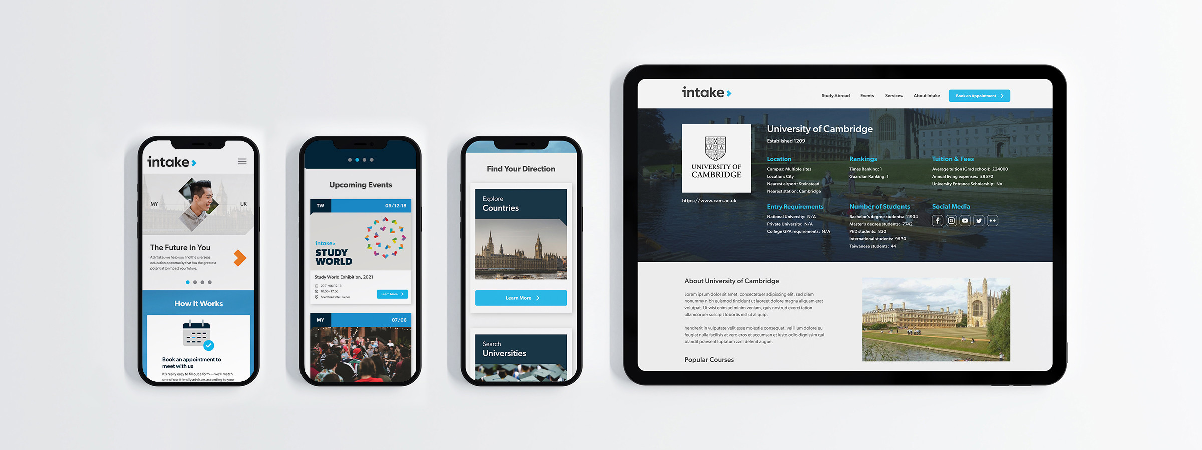
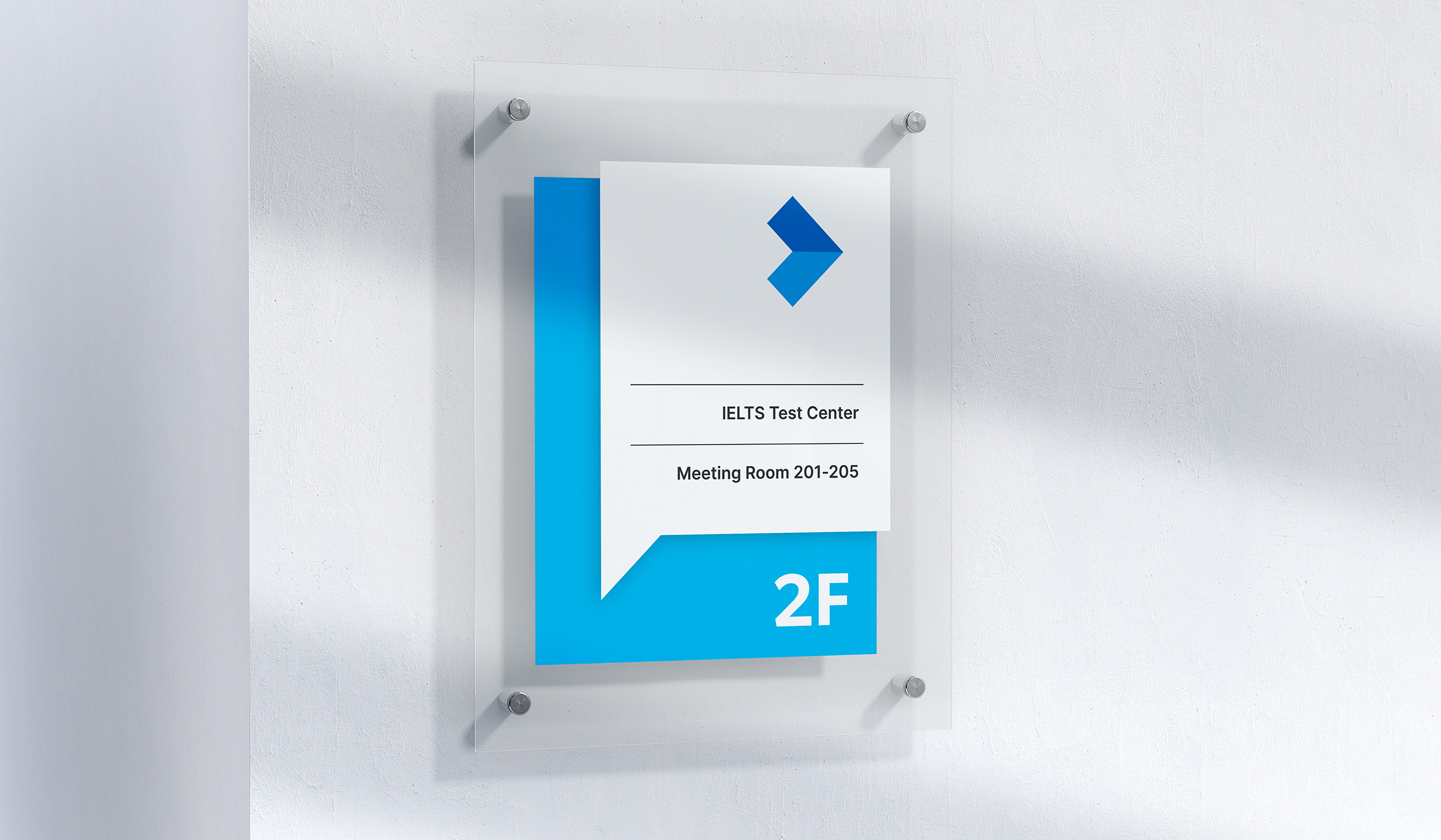
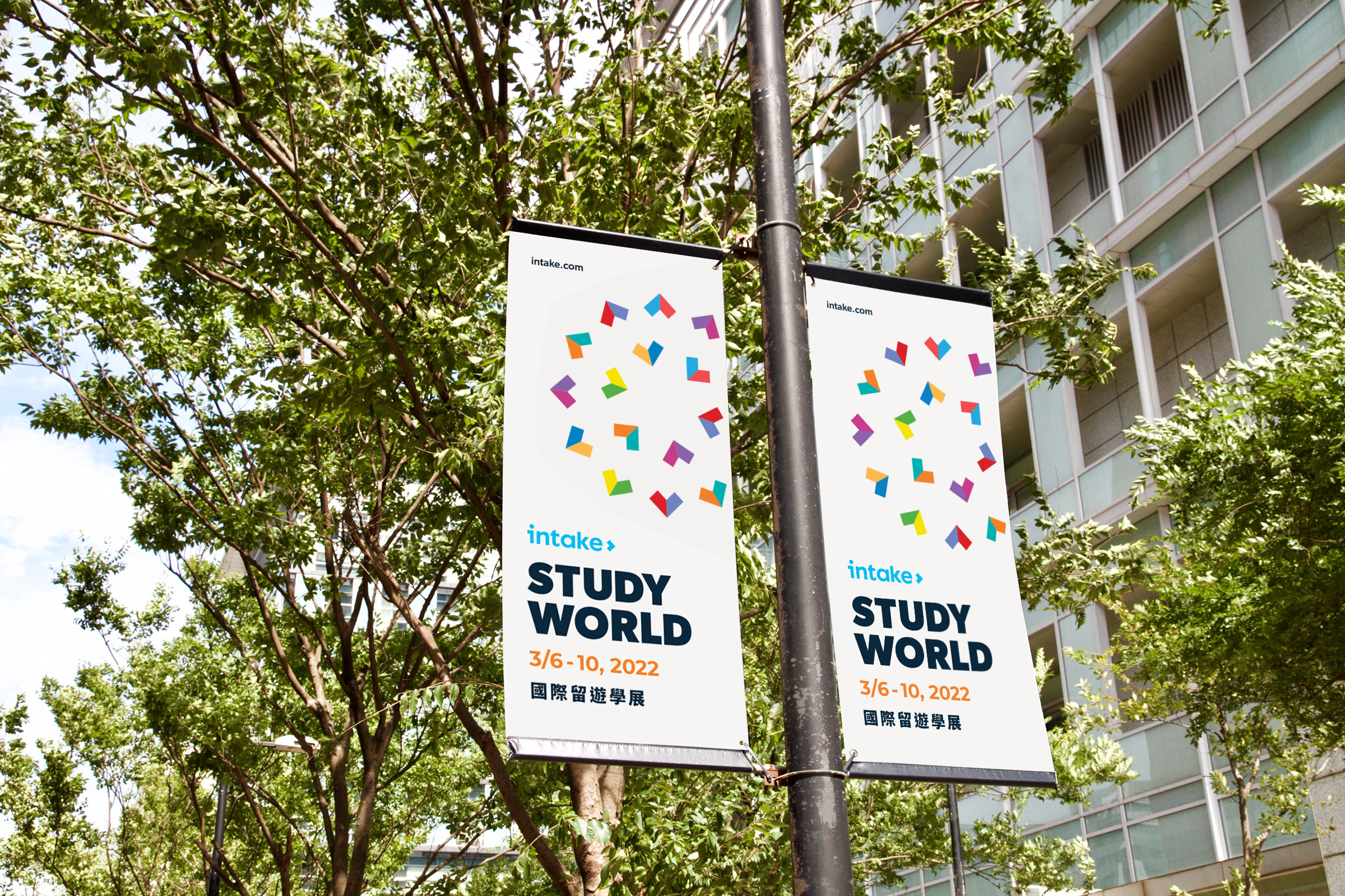
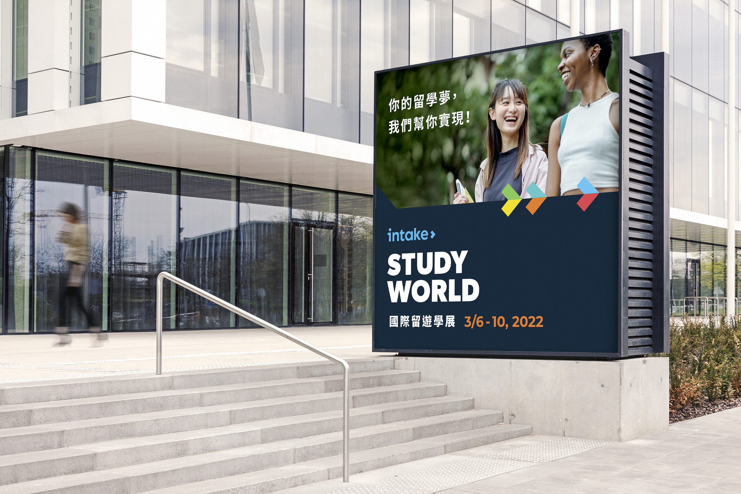
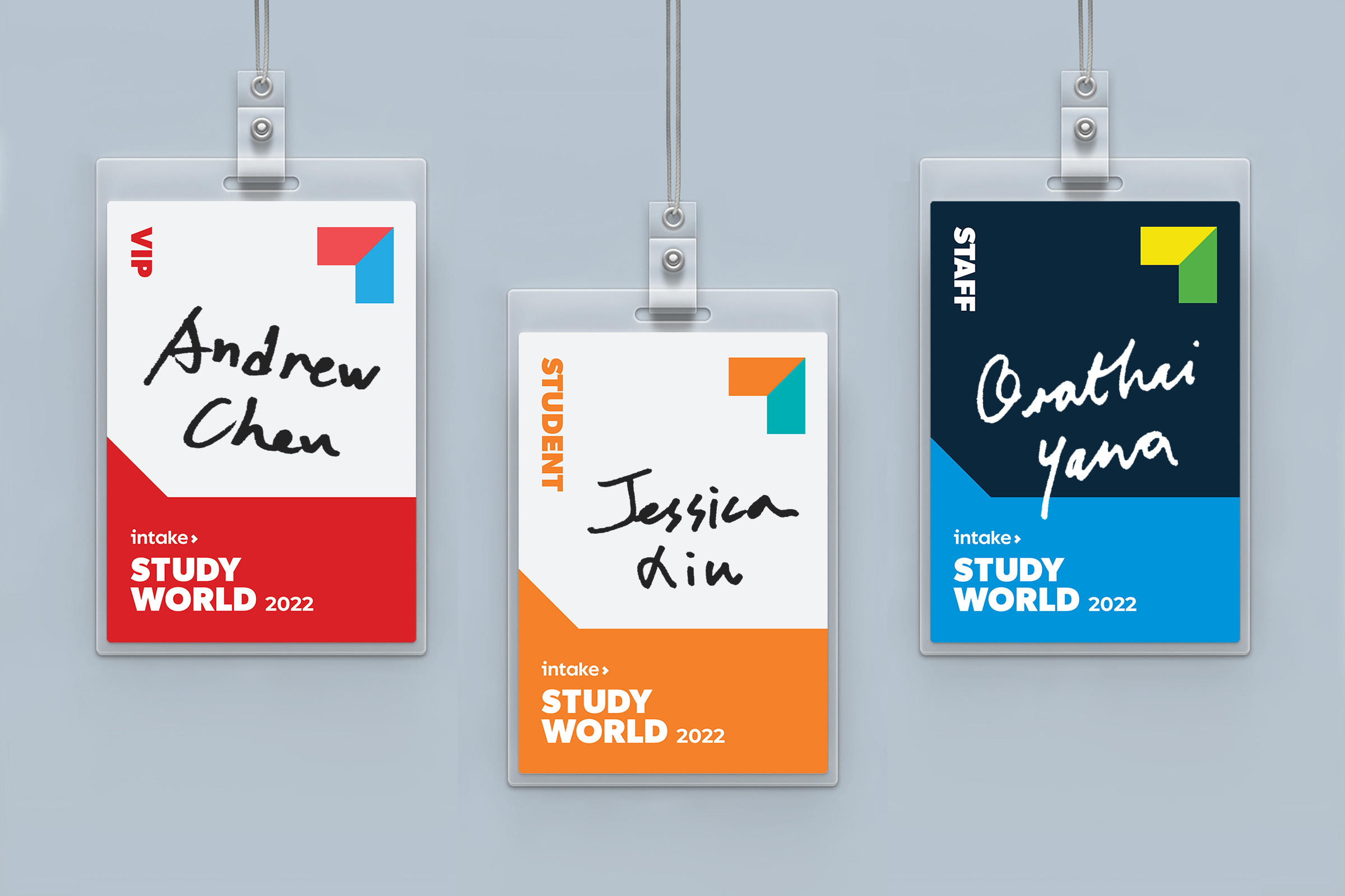
Intake’s new visual identity is also inspired by the concept of “advice”, as communicated through the authentic look and feel. The “arrow” graphic implies direction and momentum, and the speech bubble indicates meaningful conversations among advisors, alumni, and students. The overall look and feel of the brand identity is driven by a combination of strong colors, vivid design elements, and an approachable imagery style, allowing Intake to be seen as a professional yet dynamic overseas education advisory service.
A global rebrand for a global leader
Intake Education launched its global rebrand in all markets and across all platforms at the same time for maximum impact in September 2021. The rebrand had an immediate impact, both among students and the company’s institution partners, who praised the boldness of the design overhaul, and the positive, optimistic message Intake has for the future of overseas education.


